The card page type displays details for an individual record. The document page type has a similar structure and typically includes a part that embeds another page, called a subpage, for transaction lines.
Overview
Card pages
Design card pages so users can view, create, and modify master or reference records, such as customers, vendors, or items.
Document pages
Design document pages when you want to represent a transaction or other important event in the domain of business. Document pages are the computerized counterpart to paper-based documents, such as quotes, invoices, orders, and so on. As such, document pages often have associated workflow or audit trail requirements.
Associate with a list page
Both page types are typically associated with list pages that use the same source table, such as customer or sales order lists. Users select a record in the list and open its card or document page. Set the CardPageId property on the list page to associate it with the detail page. Learn more in List page structure.
Customizing pages from the client
Users can personalize card and document pages by rearranging or hiding content. Learn more in Personalizing your workspace.
Developers and administrators can use Designer to create an extension with page changes. After you deploy the extension, its changes apply in environments where it is installed. To customize pages for a particular role, use profile customization instead. Learn more in Use Designer and Customizing for user roles.
Structure
General definition
A card page has the PageType property set to Card. For a code example, see Simple card page example.
A document page is defined by a page that has the PageType property set to Document. A document page also includes a part() control that embeds another page into the document page. This typically displays line items from the associated transaction or event.
Structure
The following illustration identifies the main areas of card and document pages. Action placement can differ by version and configuration.
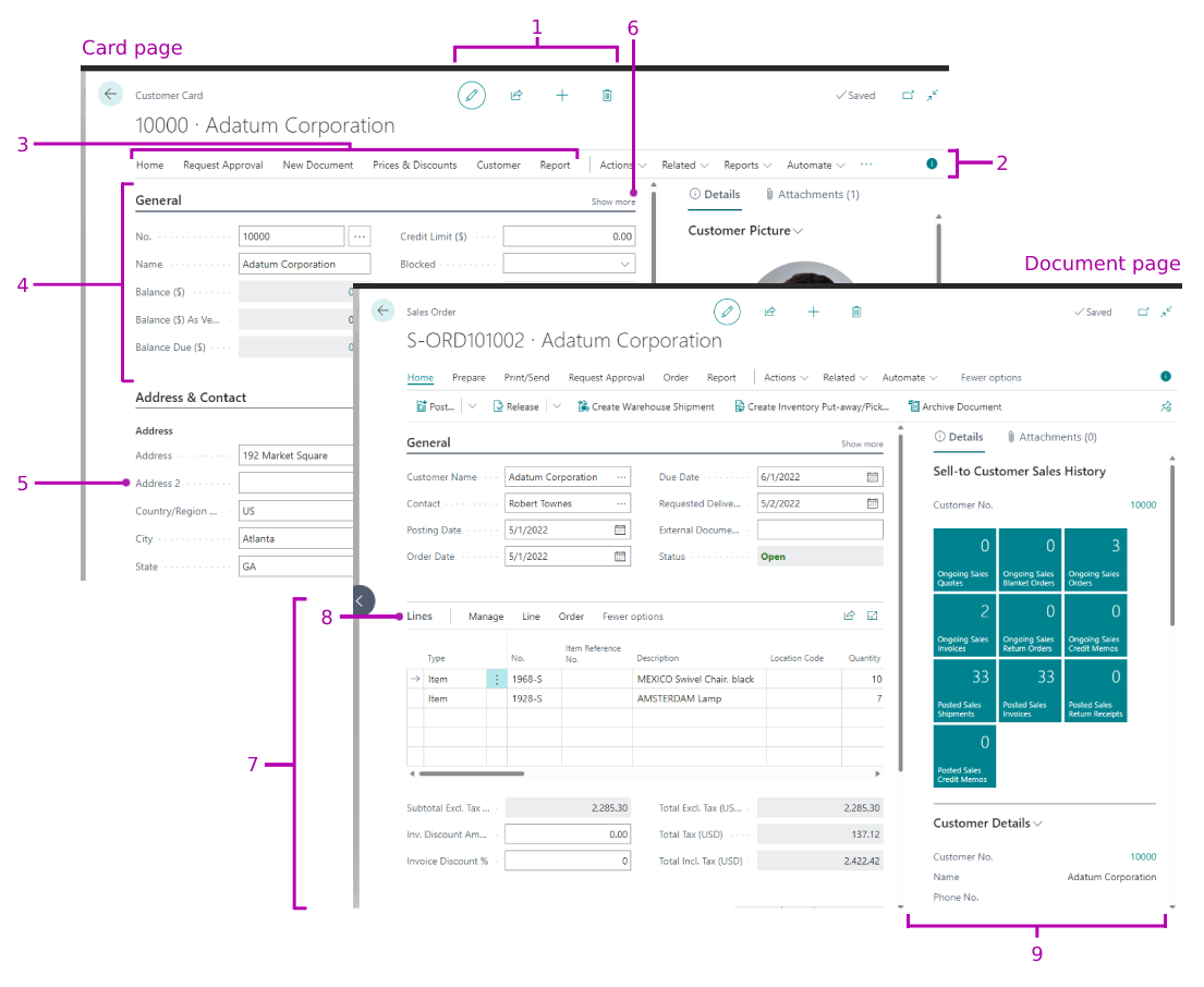
The following table describes the elements of the page.
| No. | Area | Description | Usage guidelines |
|---|---|---|---|
| 1 | System actions | The client provides actions to edit, create, or delete records. Availability depends on the page mode, user permissions, and properties such as Editable, InsertAllowed, ModifyAllowed, and DeleteAllowed. | You can't add custom actions to this system-action area. The actions shown depend on the page type, properties, mode, and user permissions. |
| 2 | Action bar | Define the action bar in the actions section and individual actions with action() controls. Actions can open pages, run reports, or execute codeunits. The resulting interface depends on the action and its target.Actions can appear on menus such as Actions, Navigate, and Report, or in promoted categories. Arrange them at the top level or in submenus. Learn more in Adding actions to a page. | Include actions that users need for the task, such as posting, running a report, or opening related information. Place important actions at the top level and group closely related actions. |
| 3 | Promoted actions | Promoted actions appear prominently on the action bar. Define action references with actionref controls in area(Promoted). Existing pages can also use legacy Promoted-related action properties.Learn more in Promoted actions. | Promote important actions so users can find them easily. The placement of other actions depends on the action-bar layout and client. Older layouts use More options to show actions that aren't promoted. |
| 4 | FastTab | A FastTab groups fields under a common heading. Define it with a group() control in area(Content). A page can have multiple FastTabs. The page definition provides their initial order; extensions, profile customizations, and personalization can change it. | FastTabs help users find information in separate groups. The client arranges fields into columns according to available space. Use grid() and fixed() controls when a specific arrangement is needed. Learn more in Field arrangement on FastTabs. |
| 5 | Field | A page field displays a source-table field, an AL variable, or an expression. Add it with a field() control. The page definition provides the initial order; extensions, profile customizations, and personalization can change it. | |
| 6 | Show more/less | Users can show more or fewer fields in a FastTab. Set the Importance property to choose which fields appear by default and which values appear in the collapsed FastTab heading. | For pages with many fields, show the most important fields by default and let users show more fields as needed. |
| 7 | Subpage | Displays line items associated with a transaction. A part(Name; Page) control identifies the embedded page. In the illustration, a ListPart page displays sales order lines. | |
| 8 | Subpage action bar | Displays actions defined on the subpage. Define these actions in the same way as actions on the main page. | |
| 9 | FactBoxes | The pane on the right contains vertically arranged parts. They can display pages, charts, or system parts such as Notes and Record Links. Learn more in Adding a FactBox to a page. | Show information related to the current record. For example, show sell-to customer sales history for the selected sales order. |
Behavior points
- The client adds system actions based on the page and its available capabilities. For example, Show Attached provides access to attached information.
- Search depends on the page and client capabilities. Open in Excel applies to supported list-based pages and list parts, not to the card or document page as a whole.
Developer tips
From the user's perspective, the following are qualities of a well-designed card and document page:
Card pages
- Use it for master or reference data.
- Give the page a title that identifies the record.
Document pages
- Use it for a transaction or other important business event.
- Give the page a title that identifies the transaction or event.
General page design
- Organize data in FastTabs and show or hide fields by default based on their importance.
- Place the most important fields in the first FastTab, typically General, in a natural order for users.
- Include one or two FactBoxes with useful statistics and links to related documents.
- Use
group()controls within FastTabs to organize fields into subgroups. - Use the Visible property to show or hide fields dynamically based on AL logic.
Designing for devices
Mobile devices generally display the same content as the web client. The layout adapts to the device and how users interact with it.
You can preview how your page will look on mobile devices directly in Designer.
Promote frequently used actions
Promote the authored page actions that users need on phone and tablet clients. Learn more in Promoted actions.
Designing the subpage lists
Choose the tile fields
On phones, line items display as tiles. Tablet clients can display line items in a grid. Define a fieldgroup(Brick; <Field>) in the source table to choose the tile fields. If you don't define Brick, the client uses DropDown. If you don't define either field group, the client uses the first five available repeater columns. Learn more in Field groups.
Configure line-item shortcut actions
Use the Scope property to configure actions in the shortcut menu for a line item. This property is useful for actions related to the selected line, such as Line Comments.
Configure gestures for actions
Use the Gesture property to configure the swipe direction for running actions on a touch device. Learn more in Implementation tips for gestures.
Related information
AL development environment
Page types and layouts
Page extension object
Actions overview
Adding pages and reports to search
Personalizing your workspace
Use Designer